Please work on tab grouping instead!
Now this would be useful.
It was useful 8 years ago when they removed it, that’s for sure.
Or vertical icon-only tabs!
Here I’m still waiting for an official vertical tabs feature.
In the meantime, Floorp has it built-in to the browser.
I really hope you can turn this off
There’ll be a setting in about:config no doubt.
This is not even close to the worst thing they have ever done, but stuff like this is a waste of resources. People mostly want official vertical tabs and more than anything engine performance improvements. (and the ability to pretend to be Chrome in Youtube)
engine performance improvements
Absolutely. Firefox is so slow compared to Chrome. Switching tabs, scrolling, video calls, … sure. Sure, Chrome/Chromium is a memory hog, but come on Mozilla, just invest in Servo already and stop adding useless features.
This was already a thing for ages until they killed it, but it is still possible if you are okay with tweaking userChrome.css
Why Mozilla wastes resources on their own implementation instead of providing API’s to third party developers is beyond me.
Your first link is based on XUL, which was deprecated because it was wasting resources being unmaintainable and insecure.
Here’s a great article about that
Admittedly, yes, XUL was a complete shitfest. Though I remember that it was more due to security patches and poor memory management that caused the apparent poor performance, not so much for addons. I was on waterfox classic at the time of writing of this article and had like 30 addons enabled, including TST, CRT, and TileTabs. all non-e10s-blocking, and, I assure you, it was just as fast(and slow) as quantum.
But, that’s besides the point. Customization, especially via addon’s, was one of the defining features of Firefox. Before, you had opera, which you could customize it within certain limits, Firefox if you want full control, and IE if you’re a dummy. Now, you have Vivaldi if you want customization within certain limits, Chrome if you’re a dummy, and Firefox is… just… not chrome? I’d say the addons should’ve been kept at all costs, maybe in a different way, without amputating the whole browser. But they did and it lost it’s appeal to a major portion of people. Of course there are still exclusive features like container tabs and min vid, but those are not exclusive to quantum either. The whole ordeal sounds just like that time when Yandex, in order to solve a support ticket overflow, just removed the contact support button.
How about if I go away from the mobile app and then go back into it, then it doesn’t reload the page I was just on. I can still see where I was until I click it, why do you need to reload it? Fuckin’ bullshit.
I don’t see this behavior on android. Is it impossible that there is some kind of phone battery or memory usage process that’s causing the sessions to be discarded?
When the OS tells Android Firefox that the phone is running out of ram, it murders any tabs it thinks you might not be looking at, to avoid being murdered by Android for its ram.
I just replicated it by opening a second app. It doesn’t seem to do it every time.
I had that with my old phone, it’s gone with more RAM
My phone has this problem. It’s RAM.
My phone is literally never not using the full 8 GB it has, and it’s constantly juggling. Even when I have next to nothing open.
What’s eating it all? Fuck if I know. My phone also has a system memory leak that has eaten up 90% of the onboard storage with modem crash dumps I can’t delete without root, and this phone has no custom firmware to do that. Got what I paid for, I guess…
If this defaults to on, I’m turning it off.
Out of curiosity, why? If it’s a knee-jerk reaction to change that’s completely understandable, but I can’t see anything to dislike about the feature itself
I can already read the title of the page and see the favicon, so it actually doesn’t show new information. If I accidentally move my mouse there it covers a big part of the page i’m looking at
When I shop online, I have many tabs from the same site open. The tab title is the store name + the item name, so the item name never fits. A bunch of identical ebay icons is way worse than this.
I understand it may be useful for some people, but I’m simply not one of them
But that’s not what you wrote. You claimed that it doesn’t show new information because you can see the favicon and title. It does show new information.
This has been people’s reactions to anything good that comes into Firefox for close to 20 years now
It’s a good feature, and probably makes sense to default to on. But I know I’ll find it more distracting than useful, so I’ll turn it off.
Large tooltips on mouseover are usually distracting. Facicons, text, and additional windows do enough to remind me what my tabs are.
New features often aren’t helpful to each and every user, but as long as I can turn off the ones that are actively unhelpful to me, I’m perfectly happy to see them.
I’d rather have them work on fingerprint spoofing, and getting rid of the tracking from google they put into it
Librewolf, if you want to use a firefox based browser, use librewolf instead.
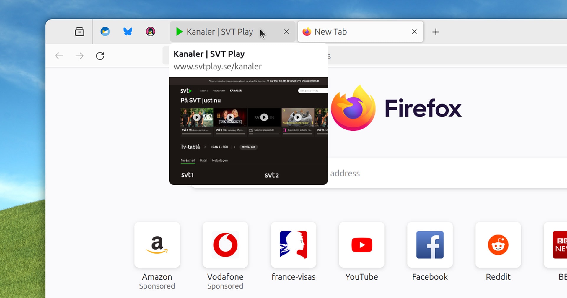
In current versions of Firefox you hover your mouse over a non-active tab […] to see (after a small delay) a tooltip containing the web page title.
Uh… what is the point of that? If I am looking for a specific tab then:
- I probably want to switch to the tab that I am looking for, so staying on the current one is not required
- if there are a few tabs from different pages from the same domain the difference might be hard to see on a thumbnail (similar page headings with logos)
- and most importantly: opening the tab is faster than waiting for the delay anyway
This sounds like a “cool” feature that’s looking for an actual problem to solve.
Tooltips are a standard accessibility feature. Just because you may not find them helpful doesn’t mean others do not benefit. The delay is to ensure they don’t get in the way unintentionally (but still allow usage) for those who do not need the accessibility benefit at all times.
In the vast overwhelming amount of cases tooltips show additional information that you cannot see from clicking on something or provide an explanation to an option that isn’t available without scrounging through a manual. None of those apply here.
The page title isn’t necessarily visible on the web page that sets the title.
Clicking is not always a simple task.
I shouldn’t have to leave my current page just to figure out what another tab is.
Again, just because you feel something is useless or easily avoided doesn’t mean that all internet users feel the same.
Tab. Groups.
Yes
I think many people in the comments suffer from some version of curse of knowledge.
Sure, this feature us quite irrelevant for a power user who is quick to navigate the browser and needs a split second to remember what tab it is simply by reading the header and seeing the icon.
However, many less proficient people can benefit from this feature. Not once I saw how someone who has 10 tabs open and needs to go to a different webpage, starts meticulously clicking through every single one of them because they have no idea how the page they are looking for is called, they are too overwhelmed by using web as a whole to take notice.
I don’t understand how someone can have 10 or more tabs open. The times when I have “many” tabs open is when I’m looking for references while doing art, and that still hardly ever surpasses 5 tabs! XD


